
Here are five things you may not know about IT sentiment surveys — and why getting them right matters more than you think.
How your brain sees left-biased surveys
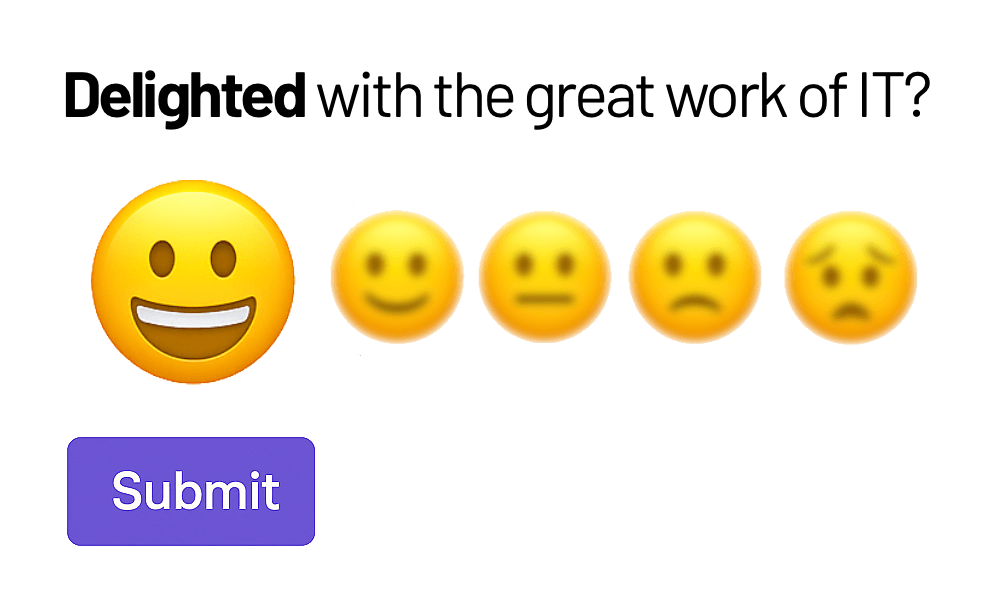
1. People are biased to the left (literally).
When people answer rating scales, they tend to click on options on the left-hand side more often than those on the right – even if the order is reversed. It’s called left-side bias, and it’s been proven in usability studies.
So if you’re running a sentiment survey and your “positive” options are on the left, your scores may skew higher than reality. That’s not insight – that’s optical illusion.
The fix? Order your rating scales from low to high, with the most positive option on the right.
2. Colour can “lead the witness.”
It’s tempting to make your survey look nice – maybe colour the top two boxes green and the rest grey or red. But when you do that, you’re nudging people to choose the “good” answers.
Colour-coding satisfaction scales might make your dashboard look healthier, but it also distorts the truth. If you’re serious about understanding sentiment, strip out the bias.
Let the data speak – not the design.
3. Email surveys aren’t dead. They’re better.
There’s a myth that email surveys are old-school, that everything needs to be embedded in Teams, Slack, or an app with an agent. In reality, email is still the #1 productivity tool for knowledge workers.
Email surveys are asynchronous – they respect people’s time and workflow. They don’t need software installed, and they’re accessible anywhere.
At Voxxify, we’ve found that well-timed, well-designed email surveys outperform many in-app methods for both reach and response rate.
4. You don’t need to limit free-text feedback anymore.
A common IT tactic is to ask for only one open-text comment to “reduce analysis time.” That made sense when humans had to read and categorise every comment.
But now, with Voxxify’s AI engine, we can process tens of thousands of open responses in under 10 minutes, extracting precise themes, sentiment and trends automatically.
So don’t limit your people. The more context they give you, the smarter your decisions become.
5. You can ask more than 3–4 questions (if you do it right).
The old rule was “keep it short or people won’t finish.” That’s true if your survey feels clunky or irrelevant – but not if it’s designed well.
When you ask clear, relevant questions that flow naturally, you can comfortably go up to 10–12 questions without any drop-off in response rate. The key is respect: respect people’s time, their attention, and their intelligence.
A thoughtful survey doesn’t feel like a survey. It feels like being listened to.
The Bottom Line
The small details – layout, colour, timing, length – make a big difference in how accurate your DEX sentiment data really is. Design it well, and you don’t just get better survey results – you get a clearer view of how people experience technology every day.
And that’s what modern IT leadership is all about: listening deeply, acting quickly, and continuously improving the digital employee experience.